BRAND NEW: FERRIES,
LOGOS AND BRANDING IN SCOTLAND
Donald E. Meek

Having recoiled in horror at the sight of Serco NorthLink’s Hamnavoe leaving the Mersey with a
totally new ‘paint job’, which features a supposed Viking warrior as its main
image, I found myself reflecting on the
use of brands and logos on Scotland’s ferries.
My interest was stimulated further by reading a sharply perceptive
article in Ferry & Cruise Yearbook
2014 by George Holland on ‘The ferry branding game’ in the English
Channel. Holland shows how Otto Thoresen
began the fashion, which was soon followed by Stuart Townsend. The practice was consolidated in Townsend’s
purchase of Thoresen in 1968. From then
on, other Channel operators, most noticeably British Rail and then Sealink (the
maritime arm of BR, later bought by Sea Containers), developed their
brands. As Holland points out, the
succession of brands and logos does more than show the various competitions,
mergers and demergers on the Channel services.
The brands and logos also carry messages, almost subliminally, about the
operator’s qualities. These messages can
be extrapolated at the time of applying the brand or logo, but also in their
later contexts. Sometimes, with the
benefit of hindsight, they can be ‘read back’ as a ‘statement’ of performance,
as, for example, with the undulations in the waving livery and brand of LD Lines,
a company which has had many ups and downs!
In the case of LD Lines, the brand merges into the colours and paint-design
of the hull.
NorthLink ships until now have been distinguished by their
light blue hulls and white upper structures, with funnels in white, blending with
the superstructure. The brand
‘NorthLink’ has been carried on the sides in a tastefully unobtrusive, but very
conspicuous, manner. This was introduced
when Caledonian MacBrayne took over the running of the Northern Isles services,
following the ending of the earlier P & O service and the introduction of
three new purpose-built vessels.
Serco, the operator since 2012, has now adopted a radically
different livery, with all-white hull and blue boot-topping, with a very large
image of a made-up Viking warrior, pointing forwards to the bow with
outstretched, raised left arm and index finger. The warrior is the logo. The NorthLink name, the brand, is on the
forward part of the hull, and is somewhat eclipsed by the proportionately
immense scale of the logo. What does
this tell us about Serco and its intentions at this stage?

First, it is evident that Serco wants to be seen as ‘the new
lad on the block’. It wants to break
with the older NorthLink practice, and introduce a new era in ferry services
for the Northern Isles. The predominance
of white suggests a fresh start, a carte blanche on which only Serco has written
its name. Communities will have to work
with the implications of this, as will Serco.
Continuity is important in the minds of island communities, where
tradition and custom tend to linger.
Serco’s livery underlines, and even accentuates, the very considerable
changes in service operators which have occurred in the Northern Isles sector
since 2000, and the assigning of the franchise to Serco, which had no previous
familiarity with these routes or indeed with operating seagoing ferries of that
kind, is arguably the most decisive and thought-provoking change to date.
Second, it is clear that Serco wishes to emphasise the
distinctive cultural heritage of the Northern Isles. The islands’ links with Nordic communities,
and ancient and modern connections with these communities across the North Sea,
are well known. Serco clearly sees this
as an opportunity to champion the distinctiveness of the region which it
serves, and at the same time to make a statement about its own relationship to
that culture. This is perhaps the
contradictory point. Serco is trying to
be ‘the new lad on the block’, but also to persuade us that it is part of the
area, integral to its culture and perhaps even to the survival of that culture. The ‘new lad’ is also the ‘old lad’, aware of
his heritage, and promoting it vigorously.
However, Serco is also buying into the concept of the
‘invented Viking’, complete with horns on his helmet – one of the best-known
images of the imagined Viking. The
invention of the ‘cartoon Viking’ goes back to the nineteenth century, when
Dasent and others, including Sir Walter Scott, brought Norse sagas into popular
prominence. This, therefore, is a naïve
image, which is closer to the ‘trolls’ and ‘gonks’ of Norway than to real
history. Serco thus panders to the
popular, slapstick mindset of external perceptions of the Northern Isles. Whether Orcadians and Shetlanders think of
their ancestors in that way or not, the image is a pervasive one, hard to
eradicate from the popular mind. Serco
thus reinforces cultural distinctiveness at the risk of retaining a distortion
of historical fact. It has obviously
concluded that the risk is worth the money.
Serco’s corporate brand, with such a stark image, is without
precedent among the ferry operators of the UK. It eclipses Silja Line’s gutless seal on Baltic
ferries, and, for a comparable image, we have to look to Moby Lines, operating
in the Mediterranean. Moby is ‘the
pioneer of truly wacky paint schemes’, according to George Holland. Their initial whale motif (from ‘Moby Dick’),
as Holland says, has been almost completely overwhelmed by a tsunami of the ‘Looney
Tunes’ characters of Warner Brothers, painted in happy configurations on every
hull, with different configurations and selections on each hull. ‘Their [the
ships’] elegant lines,’ writes Holland, ‘are utterly bombarded by the madcap
cartoon creations.’ This, as Holland
notes, is ‘outrageous…yet is instantly identifiable as Moby’.

It can certainly be said that Serco is breaking the mould,
and that its motif, the Viking warrior, is ‘instantly identifiable as Serco’ –
with horns on. By contrast, of course,
Serco’s use of a single image is restrained compared with the ‘crowd’ on some
Moby hulls. What observers like me find
initially ‘shocking’ is the enormous size of the massive blue Viking, which
seems to be out of all proportion to the rest of the hull. Gone, in an explosion of white paint
reminiscent of a Mr Bean film on how to get your painting done in one mighty
blast, are the distinctive sections and levels of a ship’s configuration – the
waterline and below, the hull above the waterline, the decks above the
hull. The only concession to ‘hull
differences’ is in the section below the belting, which merges into the
boot-topping, and is blue (and may be expected to show less rust on this
particularly rust-prone part of the ship).
Otherwise, the hull is white, and the Viking image rules all, in what
immediately strikes the ‘traditionalist’ as a gauchely oversized manner,
positioned where there is the greatest depth of white ‘wall’, inclusive of the
funnel on each side.

The use of iconic warrior-images in the context of Scottish
shipping is not, however, new. David
MacBrayne in the nineteenth century, as well as several other operators, made
much play of the ‘romantic Highlander’, who appeared as a finely-crafted
figurehead on their steamships. The
tradition of carrying a figurehead of this kind was, of course, a continuation
from the days of sail, when images of worthy and not-so-worthy ladies were
carried on the stems below the bowsprit, and often seemingly supporting the bowsprit. Its accommodation to elegant steamships was
particularly appropriate on yacht-like MacBrayne vessels with names such as Clansman, Claymore, and Chieftain,
which could carry sail to some extent to supplement the engines. The Highlander might be considered a
MacBrayne logo in such a context.
However, other owners too made use of the Highlander as a
figurehead. When the Western Isles Steam Packet Company
advertised the services of its first ship, the St Clair of the Isles, in 1873, they made much of the figurehead:
Her figurehead is a Highlander in
full costume – blue bonnet with feather, dark-green jacket, Stewart tartan
plaid fastened at the shoulder with a gold brooch, his right hand is brought
across his breast as if in the act of making for his claymore, on which his
left hand is laid, and his face looks as if he were in earnest.
The steamship Davaar,
owned by the Clyde and Campbeltown Shipping Company, and also the Kinloch, likewise carried a splendid
figureheads of a Highlander on their bows.

As with the Serco Viking, the Highland warrior was intended to indicate that the ships served a region with a distinctive culture, that of the great fighting hero, likewise romanticised by writers such as Sir Walter Scott. It was not, however, the monopoly of any single company. It was part of the prevailing Zeitgeist.

The image of the romantic, kilted Highlander continued into
the more modern fleet, and was remade for new times and needs. After the Second World War, the ‘brawny-kneed
Highlander’, as I have often called him, was resurrected as a figure embossed
on a metal rectangle. He carried a targe, and thrust a sword skywards with his right arm. Reshaped and in every sense refashioned, the
image was romantically appealing, with a colourful kilt and plaid, but it was
also essentially masculine and macho, astride a Scottish mountain and piercing
the sky with his powerful ‘claymore’. Displayed in colour in relief on a gold-edged
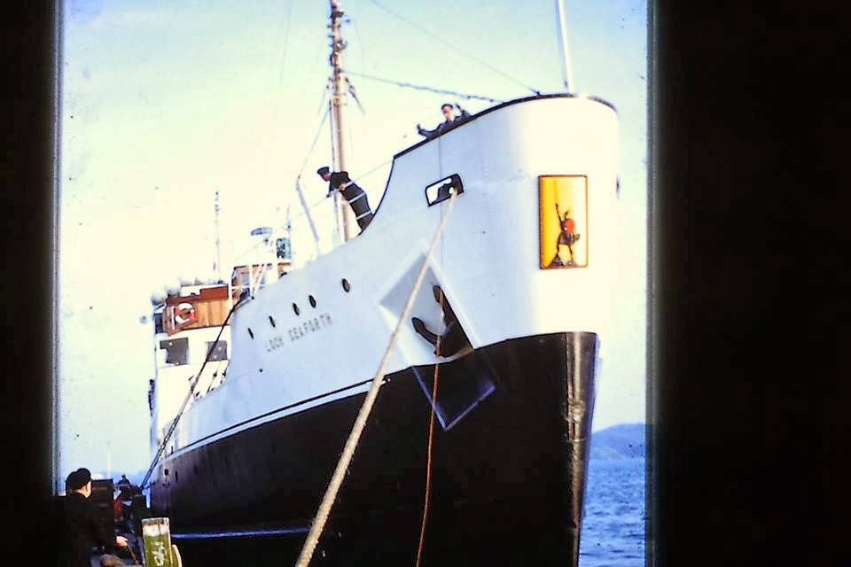
plaque, the new-styled MacBrayne Highlander appeared as a quasi-figurehead on
the bows of the 1947 Loch Seaforth
and the 1955 Claymore. With a quiet, powerful dignity, devoid of
undue flamboyance, he carried the message of ‘MacBrayne for the Highlands and
Islands’, although he represented pre-eminently the romantic Highlands, which
won the hearts and money of successive generations of tourists.
The ‘brawny-kneed warrior’ appeared on MacBrayne’s
advertising material, on the covers of brochures, pamphlets, timetables and
pre-eminently posters. He could become a
multiple image, with a clutch of kilted men, represented at their jingoistic
best as bearers of flags, in the assertive, identity-conscious MacBrayne
literature of the 1930s, in the run-up to the Second World War. Since then, he has appeared on a small
roundel on the bows of both the Clansman
(1998) and the Hebrides (2001), and he has also had a new life as the
computer-crafted logo of David MacBrayne Ltd, the holding-company of the
various operating bodies created after the demerger of 2006.

The major change, however, which the Serco warrior
represents in dramatic style, is the increasing use of the ship itself as the
advertising opportunity, a floating set of hoardings, with sides ready to win
customers in the post-1980 consumerist era, already foreshadowed by cut-throat
competition in the Channel in the previous decade. Ship sides are now utilised to carry the
strongest possible ‘short statement’ about the operator’s identity, qualities
and intentions, and make the world aware that ‘he’ is there, in the fight for
money.

The danger, of course, is that the ‘statement’ can be read
in ways that the creators and the operators did not intend, especially if it is
largely ‘wordless’ and consists solely of a logo or image. Although the Serco image points its index
finger to the future and to NorthLink, it can make connections (in the minds of
some) with the distant past, but unfortunately (in the minds of others) with
the more recent past. The domineering pose of the Serco Viking, with outstretched
arm, can recall Leif Ericsson, the Viking ‘explorer’ of Vinland sagas, but it
can also connote the famous Kitchener poster of the First World War. More worryingly, it can remind some of us of the
dictators of the Second World War and their later successors. Indeed, one may be forgiven for feeling a
frisson of fear, when a symbol which might be construed as one of aggressive,
militaristic domination presides over a hull which is almost entirely white.

Brands, based on words, are less dangerous in this respect than images, but even they can take ‘a bit of getting used to’. The earliest use of the owner’s brand on a vessel’s side that I witnessed in Scotland was the promotion of EILEAN SEA SERVICES on the revolutionary Isle of Gigha, a very basic LCT-type ferry which arrived in Oban in the early summer of 1966, and began to convey cars to Mull when the MacBrayne vessels of the time were tied up because of the seamen’s strike.

Later, when the Isle of Gigha was transferred to the ownership of Western Ferries (Argyll) Ltd and became the Sound of Gigha, it carried the owners’ ‘circle and arrows’ motif on its bows. This unobtrusive logo was a very neat summary of this pioneering company’s intention to employ and develop roll-on, roll-off principles in the Hebridean ferry trade.

A much more overt use of the ship-borne brand as the operator’s ‘ID statement’ arrived in northern Scottish waters from the Channel in the context of state-operated services, most obviously on the ships of Caledonian MacBrayne, which began to carry the brand name from 1983. This, at the time, was a massive change from the plain black hulls, with
red boot-topping and white superstructures and varnished deck-houses, characteristic
of ‘all time previously’. It was also
largely pointless, as there was no meaningful competition which justified such
a bold proclamation – nor is there still
(as with NorthLink). I well remember the
shock of seeing the 1964 car-ferry Columba,
with her sides plastered with CALEDONIAN MACBRAYNE in large letters for the
first time. My reaction was not unlike
my reaction to the new Serco warrior – ‘horrid, disgraceful, disfiguring,
desecration writ large’.

The ‘writing on the wall’, of course, became the standard
practice on Caledonian MacBrayne ships.
The brand has been written in variations of Californian 1b font on most
ships’ sides, with exceptions only in instances where the ships were too small
to carry the brand comfortably.
In due time, we all came to accept the ‘bill-boarding’, just
as we came to accept car-ferries themselves, which were also a ‘shocker’ to
some conservative souls long familiar with the derrick-swinging motor-ship.
Should we now be preparing for the re-emergence of the
‘brawny-kneed Highlander’ in ultimate grandeur, perhaps in ‘full fig’ after the
next contract for the provision of CalMac services has been settled?

A lot will depend on who the new operator will be, and how
much latitude is granted by CMAL in remaking the brand. But perhaps even more will depend on the
endurance of Serco’s new Viking warrior, as he battles with the Pentland Firth
and the Merry Men of Mey. If he becomes
no more than a rust-scarred shadow of his former Mersey majesty within six
weeks of sallying forth into the Swelkie, few will be surprised, and he may
well contribute to the sinking of such iconic adventures in corporate identity. The
hulls of ships operating in the stormy waters of the Hebrides and Northern
Isles were painted in dark colours, not because of some northern gloom in the
minds of the owners, but because the owners knew full well what salt water did
to metal.
If he survives the tempests and remains unsullied, rustless
and pure, it may be that even the ‘traditionalists’ will come to regard him as
yet another ‘old friend’. Perhaps he may
become the template for the return of the brawny-kneed Highlander to Hebridean
ferries – painted in full glory on their sides!
